
How to Read a Flame Graph and Find CPU Bottlenecks
Learn how to read a flame graph, separate CPU samples from trace timing, find wide hotspots, and verify each performance bottleneck.
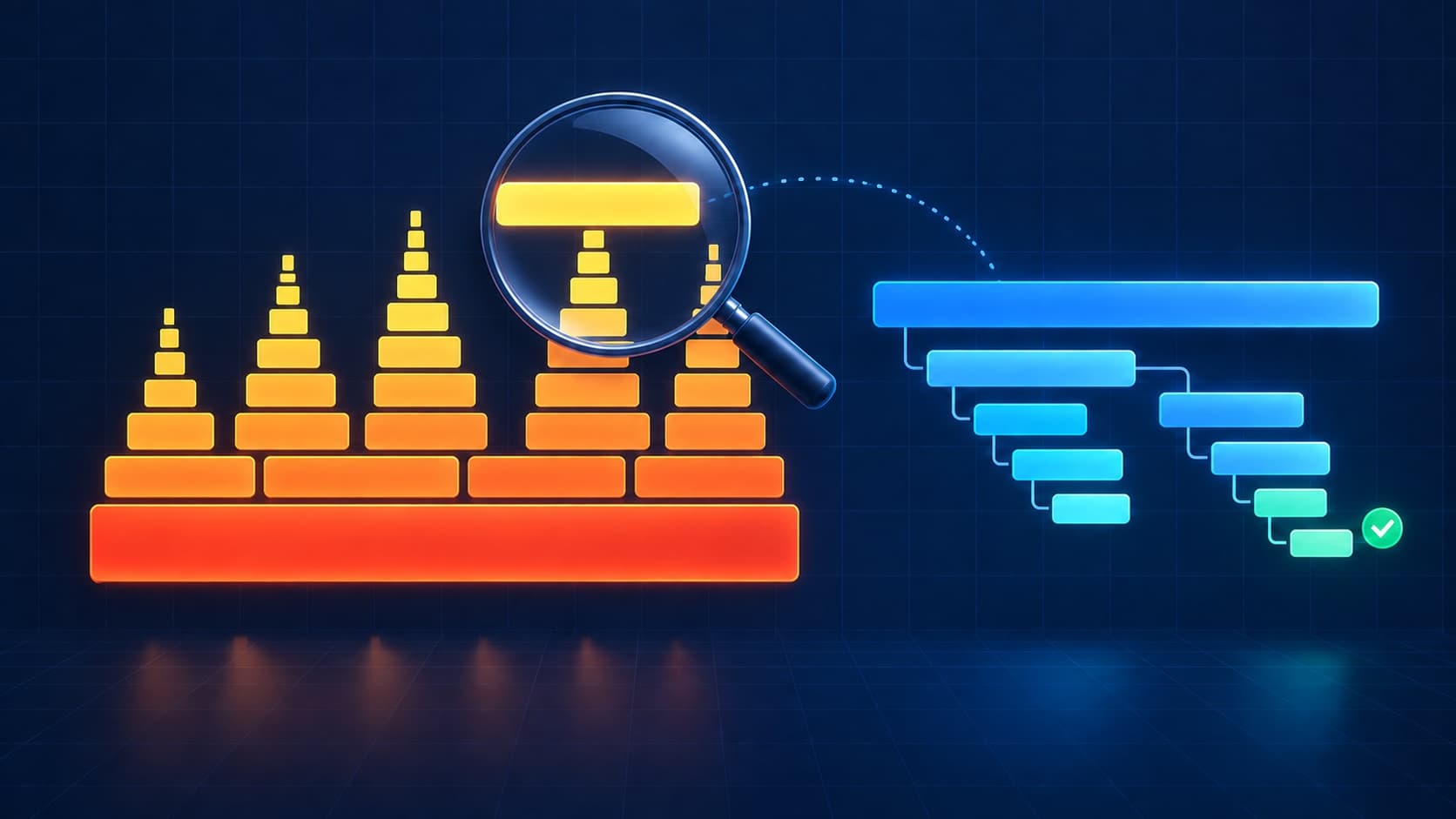
If you need to visualize CPU profiling data, start with a flame graph. It compresses thousands of sampled call stacks into one view.
This guide shows how to read a flame graph and find a performance bottleneck. It also explains a common source of confusion: CPU flame graphs and trace flame graphs answer different questions.
Flame graph quick reference
| Part | CPU flame graph meaning | First question to ask |
|---|---|---|
| One box | One stack frame or function | Which function is this? |
| Box width | Share of samples containing that frame | Is it wide because of itself or its children? |
| Vertical position | Call-stack depth | Which caller led to this function? |
| Horizontal position | Grouped stack order, not time | Do not read left to right as a timeline |
| Top edge | Code running when samples were taken | Which wide top block consumes CPU directly? |
| Color | Usually visual separation | Check the tool before assigning meaning |
The original CPU flame graph guide defines these rules. Its key warning is simple: the horizontal axis does not show elapsed time.
What a CPU flame graph shows
A CPU profiler samples running stacks at a fixed interval. Each sample records the current function and its callers.
The flame graph groups identical stacks and draws one box for each frame. Wider boxes appear in more samples.
That width represents sampled CPU use. It does not represent call count. A wide function may run slowly, run often, or both.
The bottom frame is usually the process entry point. Child calls stack above their parents. Some tools invert this layout into an icicle graph.
The width includes child work
A box has two useful costs:
- Total or cumulative cost includes the function and every child above it.
- Self cost includes only samples where that function sits on the top edge.
This difference prevents a common mistake. A wide parent can look expensive even when one child performs almost all work.
For example, renderInvoice() may span 40% of the profile. If compressPdf() fills most of its top edge, optimize compressPdf() first.
Grafana's flame graph documentation also separates self value from cumulative value. Use both when your profiler exposes them.
How to read a flame graph in five steps
1. Confirm what the profile measures
Check whether the graph measures CPU, allocation, memory, lock time, or off-CPU time. The same shape can represent different resources.
Do not use an on-CPU profile to explain a request that only waits for a network response. That wait may use little CPU.
2. Check the capture scope
Record the process, host, release, workload, and capture window. A flame graph without this context can send you toward irrelevant code.
Use a representative slow period. Avoid mixing unrelated workloads unless you can filter them later.
3. Scan the top edge for wide plateaus
Start at the top edge. Wide, flat blocks show functions that were directly running during many samples.
These blocks are strong CPU hotspot candidates. Narrow top blocks may still matter, but they contribute less to this profile.
4. Follow each hotspot down to its caller
Move down from a wide top block. The frames below it show the call path that reached the hotspot.
This path explains ownership. The same library function may appear under several application paths.
5. Validate with a second measurement
Make one focused change. Repeat the same workload and capture another profile.
Compare CPU time, throughput, latency, and the new flame shape. A narrower block alone does not prove that users see an improvement.
Flame graph patterns that matter
| Pattern | Likely meaning | Next check |
|---|---|---|
| Wide block on the top edge | High self CPU use | Inspect loops, parsing, serialization, or compression |
| Wide parent with one wide child | Cost sits mainly in one callee | Follow the child before changing the parent |
| Wide parent with many narrow children | Work spreads across helpers | Check total cost and repeated calls |
| Same function in several towers | Many callers reach one function | Use caller or sandwich views |
| Large unknown or hexadecimal frames | Symbols are missing | Fix symbol resolution and capture again |
| Mostly scheduler or wait frames | Wrong profile type for the problem | Capture off-CPU data or use tracing |
| Shape changes only under load | Contention or workload sensitivity | Compare equal traffic and release conditions |
A tall stack is not automatically bad
Height shows depth, not cost. A tall, narrow tower may contribute very little CPU time.
Optimize width before height. Only inspect depth when recursion, wrappers, or excessive indirection creates measurable cost.
Colors are not universal
Traditional CPU flame graphs often use warm colors without semantic meaning. Other tools color frames by package, service, or value.
Read the legend first. Do not assume blue means a database or red means an error.
CPU flame graph versus trace flame graph
Many observability tools use a flame-shaped layout for distributed traces. The layout looks similar, but the data has a different meaning.
| Question | CPU profile | Distributed trace |
|---|---|---|
| What is measured? | Sampled stack activity | Timed spans |
| Typical unit | Samples or CPU time | Wall-clock duration |
| Best use | Find hot functions | Find slow requests, services, queries, or dependencies |
| Shows waiting? | Not in a normal on-CPU profile | Yes, when a span covers the wait |
| Shows every function? | Only sampled and resolved frames | Only instrumented operations |
| Horizontal order | Usually not chronological | Depends on the trace renderer |
Use a trace first when an API request is slow. It can show whether the delay comes from a database, another service, or an external API.
Use a CPU profile when the trace points to application work and the process is CPU-bound. The profile can then identify the hot function.
The latency investigation guide explains this trace-first workflow. The event loop guide covers Node.js saturation signals.
How Tracekit handles flame graphs
Tracekit's current flame graph is trace-based. It builds a hierarchy from OpenTelemetry spans and their parent identifiers.
Each block uses span duration in milliseconds. Use this view to find slow service calls, database spans, and instrumented application steps.
The view supports span search, hover details, and zoom. You can also use the Trace Visualizer with OTLP, Jaeger, or Zipkin trace data.
Tracekit does not currently collect continuous CPU profiles. A Tracekit span flame graph cannot identify an unsampled function inside a wide span.
When a trace isolates a slow code path, add a bounded capture point. Tracekit dynamic logs can capture runtime state without a redeploy.
Keep normal application logs in your logger. Dynamic logs are targeted capture points, not general log ingestion.
How to generate CPU flame graph data
Choose the profiler that matches your runtime and operating system. Follow its current documentation because capture flags can change.
Linux perf
Brendan Gregg describes a three-stage workflow: capture stacks, fold identical stacks, and render the folded data.
perf record -F 99 -a -g -- sleep 60
perf script > out.perf
You can then use the maintained FlameGraph tools to fold and render the data.
Node.js
The official Node.js flame graph guide documents Linux perf with V8 profiling options. It also explains broken symbol labels.
Start with the documented command for your Node.js release. Confirm that JavaScript frames resolve before you trust the result.
Go
Go includes CPU profiling through runtime/pprof and go tool pprof. The official Go profiling guide shows the capture and analysis flow.
Profile the same binary that serves the tested workload. Keep build symbols available for readable function names.
Common mistakes
Reading the x-axis as time
The horizontal order usually groups similar stacks. It does not show what ran first.
Use a trace waterfall when you need chronology. Use a flame graph when you need aggregated stack cost.
Treating width as one slow call
Width comes from the profile's value, such as sample count. One function may be wide because it runs very often.
Check call counts or request traces before you describe one invocation as slow.
Optimizing a library frame without its caller
A shared library can appear under many code paths. Follow the stack downward to find the application path that owns the work.
Ignoring missing symbols
Unknown frames can hide the true hotspot. Fix debug symbols, JIT mappings, frame pointers, or unwinding before optimization.
Profiling the wrong workload
A fast test endpoint cannot explain a production batch job. Capture the workload that produces the actual performance problem.
Confusing CPU time with request latency
A slow database call can dominate wall-clock latency while using little application CPU. Pair the profile with a distributed trace.
If the trace shows repeated database spans, use the N+1 query guide.
A practical bottleneck checklist
Before you change code, answer these questions:
- Does the graph measure the resource I need to explain?
- Does the capture include the affected release and workload?
- Which wide frame reaches the top edge?
- Which caller path owns that frame?
- Are function names and symbols complete?
- Does tracing show CPU work or waiting?
- Can I reproduce the hotspot with the same workload?
- Did the fix improve an external result, such as latency or throughput?
Frequently asked questions
How do I read a flame graph?
Find wide blocks on the top edge, then follow each block downward through its callers. Width shows relative value, not chronology.
What does a wide block mean?
It means the frame appears in a large share of the measured value. Inspect self and cumulative cost before choosing a fix.
What does the top of a CPU flame graph show?
The top edge shows functions running when samples were taken. Wide plateaus on this edge are direct CPU hotspot candidates.
Does a flame graph show time from left to right?
No, a standard CPU flame graph groups similar stack frames. Use a timeline or trace waterfall for execution order.
Can a flame graph show an N+1 query?
A trace view can show repeated database spans. A CPU flame graph may not show network waiting or query count clearly.
Should I start with tracing or CPU profiling?
Start with tracing for slow requests. Use CPU profiling after traces and CPU metrics point to local application work.
Final rule
Read the data source before you read the shape. Then find a wide top-edge frame, trace its caller path, and verify the fix.
Related Posts
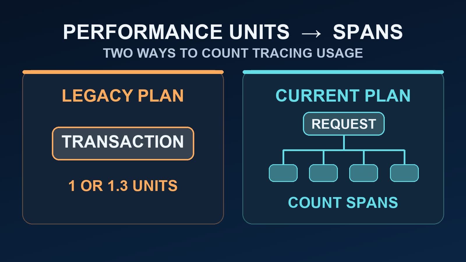
Sentry Performance Units vs Spans: What Changed?
Learn when Sentry performance units still apply, how legacy transactions were counted, and why current span quotas need a different estimate.
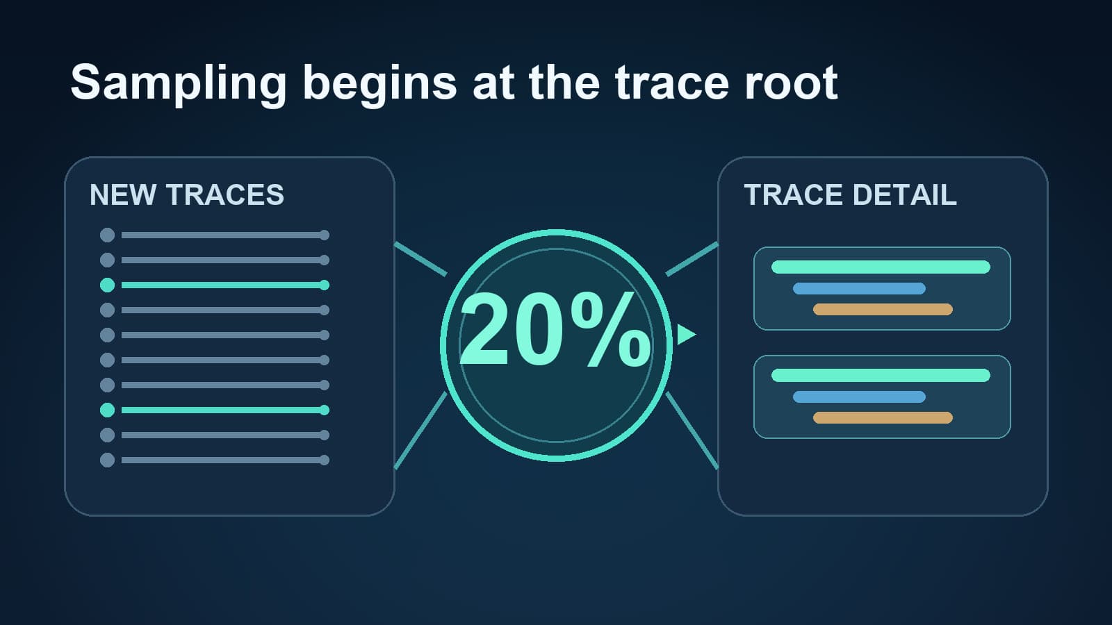
Elastic APM Transaction Sample Rate: Setup and Checks
Set ELASTIC_APM_TRANSACTION_SAMPLE_RATE, check why it seems ignored, and map the setting to OpenTelemetry sampling during a migration.
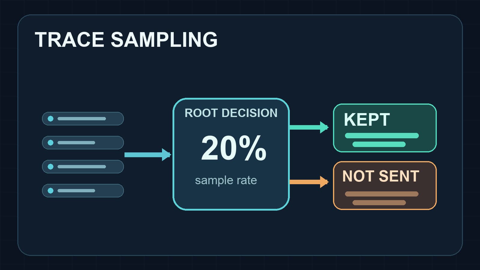
DD_TRACE_SAMPLE_RATE in Node.js: A Practical Guide
Set DD_TRACE_SAMPLE_RATE in Node.js, understand rate limits and sampling rules, and verify which distributed traces reach Datadog.